
Lining Grotesk
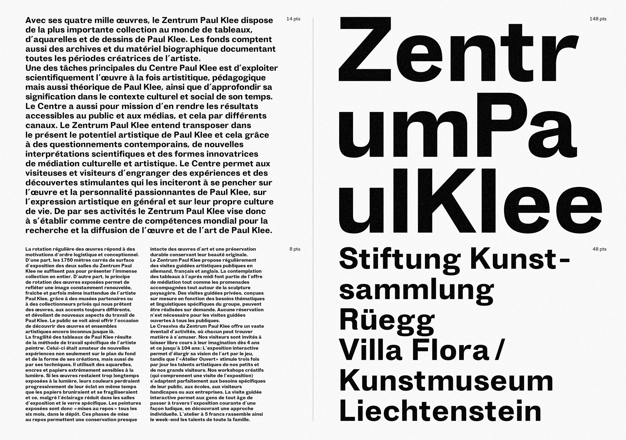
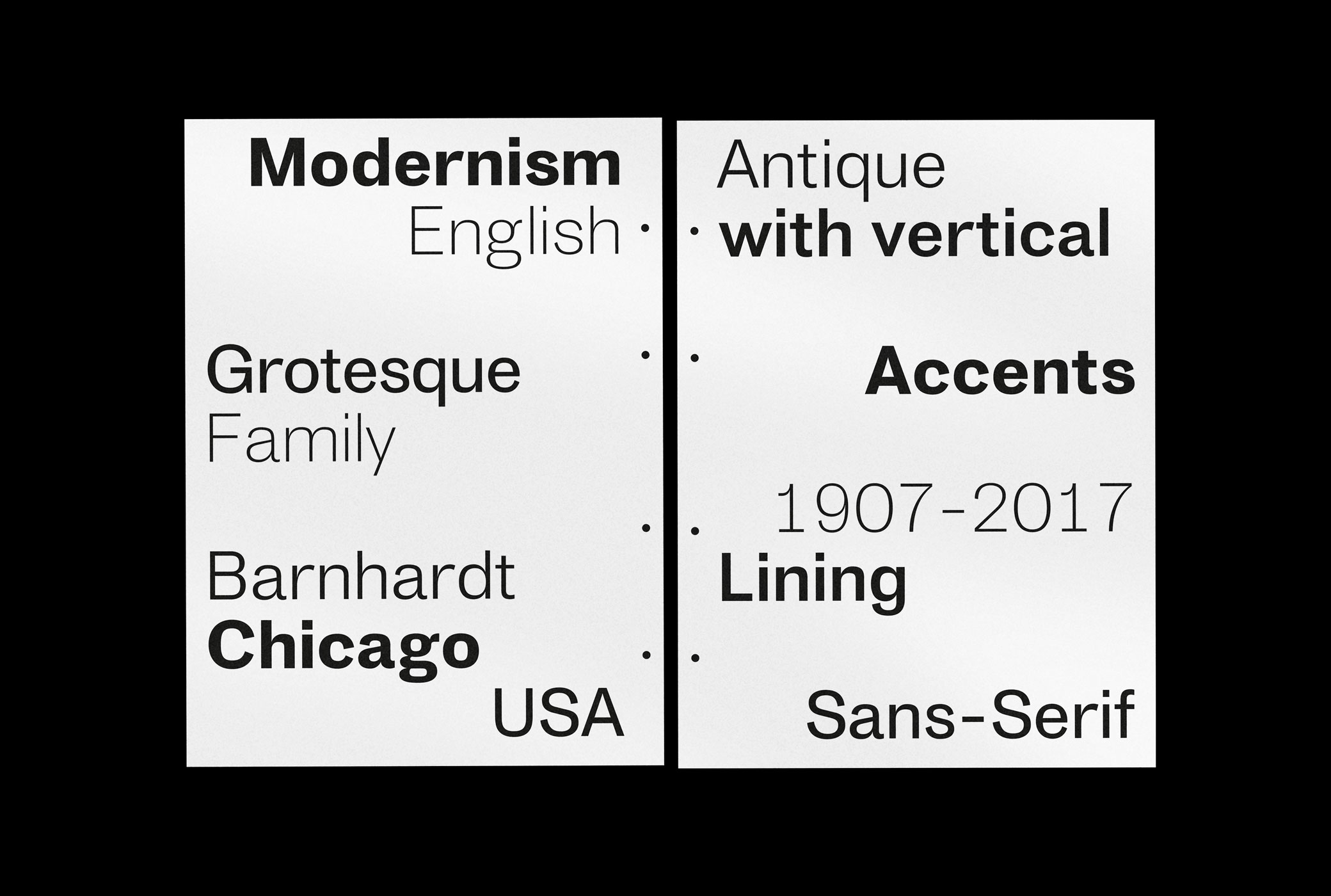
The Lining Grotesk is a sans-serif type family of five cuts inspired by the early english grotesques of the 20th century. I mixed elements from sources of that era with more contemporary and personal solutions to give it a unique touch.
The font is characterized by its pronounced vertical accents which give an overall rhythm in small text sizes and is more distinctive in larger sizes. It has wide proportions with a tight spacing and thin junctions. The family consists of five different weights, ranging the Extra-Light to Extra-Bold.
Informations
|
Technical informations |
5 cuts typeface, OTF format |
|
Field |
Type design |
Explore more projects


